Shipwell Identity & Design System
Role: Design, Direction
Picture it, a zoom meeting in in 2021. Designers, marketers and a sprinkling of freelancers spread across the screen in their neat little rectangles. The topic of discussion? Shipwell's identity and design system.
The time had come! Over the course of last two years, the Shipwell brand had gone through a series of small aesthetic changes and it was time develop a definitive system and formalize what we had been experimenting with.
With freelancers and contractors playing a larger role in our creative production I wanted to give them a single source of truth to empower them to make creative decisions. This also provided an excellent opportunity to create some additional branded assets that our partners and stakeholders could use in ad hoc decks and presentations. 
I’ll spare you (most of) the nitty gritty and give you the guiding principles I used to put everything together:
It needs to be easy to access, deploy, and understand. There should be minimal time spent referencing a guide for hex codes. Human bandwidth is expensive and finite.
Color and typeface considerations should be ‘digital first’. Shipwell’s marketing and branding footprint is almost accessed, viewed and shared online. Print is GREAT but it’s really only going to be a ‘thing’ for events and we’ll have specific guides for that.
The system should be thorough. Icons? Illustrations? Stock photography? Included. In the case of stock photography, what to look for when shopping for a new image should be clear as well.
Easy to access, deploy, and understand. I’m Including this twice because it was just that important.
Don’t touch the logo. Oh how sweet it would be to make a mark on the brand with a new logo but some things don’t need to be changed. Plus the benefits wouldn’t outweigh the potential cost.
Without further adieu let's take a look!
Color
Oh the mighty hues of ‘blue’!
From 2015-2019 Shipwell’s only colors were blue, blue and a little splash of green and as the company and product has grown, matured and differentiated so has the palette.
Just like we didn’t touch the logo, we didn’t discard those original colors opting instead to add some more. You can easily design yourself into a corner with only a bright and dark shade of blue. But with nine? You got yourself a stew!
The new neutral shades allow us to have a lot of more aesthetic complexity in compositions. It’s not just ‘stop’ or ‘go’ - there's a shade for every 'speed'.

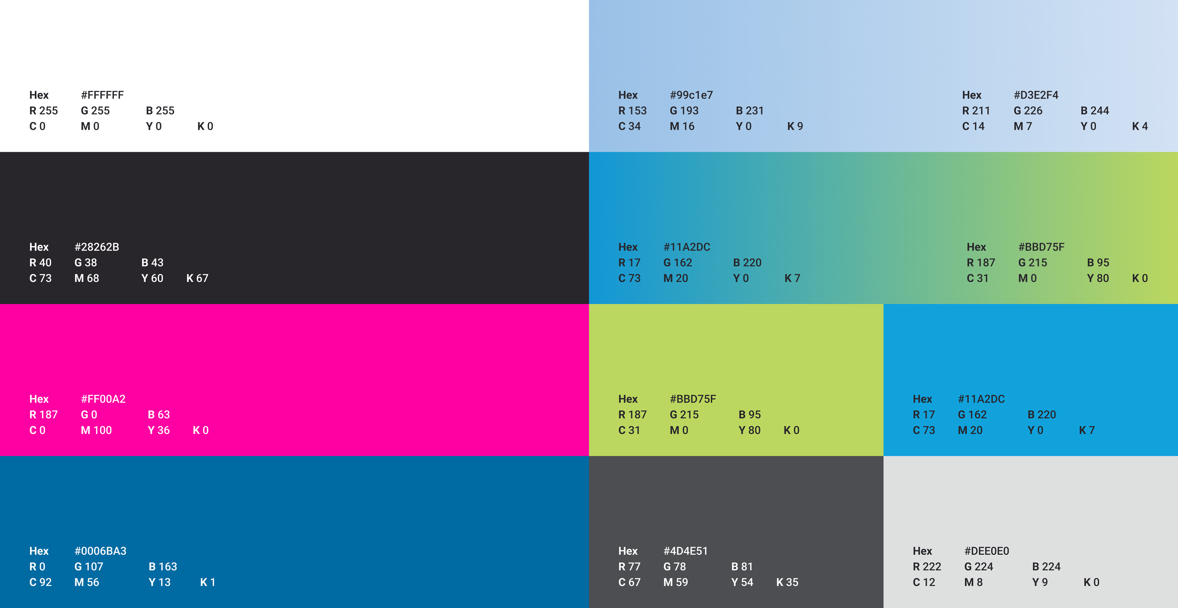
Look at all those hex codes!

“I thought you didn’t want to people to have to reference a million hex codes?” I hear you say to yourself.
Good news! They don’t!
Figma and Adobe libraries have brought us out of the stone ages and into the light. Both platforms offer libraries with intuitive labeling / naming that make deploying these colors an absolute breeze and make me wonder just how we got things done in a timely manner.

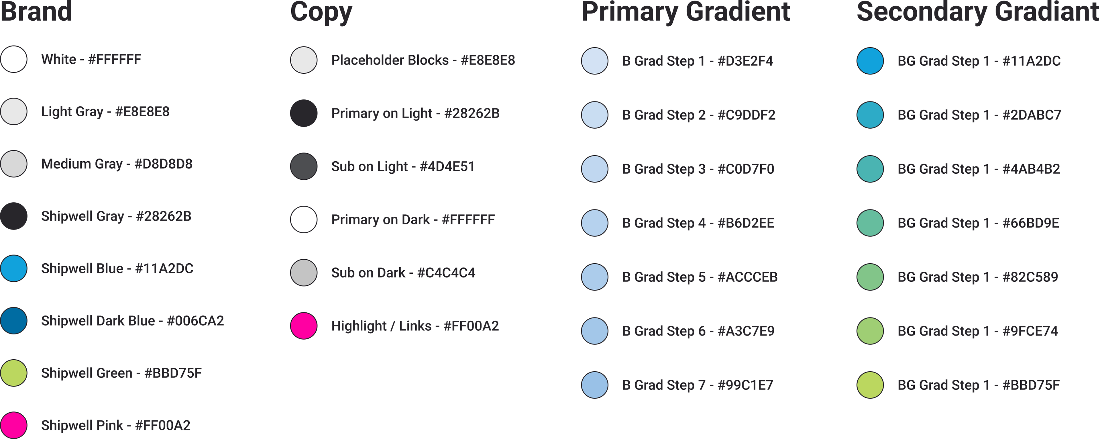
A color for every occasion, element, and line of copy

I’ve talked a lot about our sea of blues up to this point and passingly mentioned the Shipwell’s OG Green. Looking at the palette and swatches above you might have noticed a shockingly pink elephant in the room.
Remove that pink and green and you’re staring at the same pallet almost every other logistics focused tech company is using. For a company that wants to stand out with a product that beats the others it just won’t do.
I took a little inspiration from my own personal branding and dipped into a color I’ve been using to stand out for while now.
PINK.
Adding this color worked like a charm and along with injecting some ‘fun’ into our creative approach we saw our engagement SOAR.

I just think it's neat!

Typography
Ah, typefaces, every designer’s favorite topic! Mine as well, but you won’t find some niche boutique choice here. Ease of deployment and digital first were the priorities and everyone’s good friend Google provided a great, clean, relatively neutral typeface readily useable in every program, browser, deck-creation program available on the market.
Never would the word ‘damn’ have to uttered when trying to find this typeface. Click that dropdown and it’ll be there. I don’t think even Helvetica has that going for it.
We use primarily use Roboto in three weights to maximize the impact of each weight. Bold next to medium doesn’t have near the same presence as bold next to regular.
Along with the chosen three weights there’s five colors we use. Two for use against light backdrops and two for dark as well as a ‘highlight’ attention grabbing color.
Figma and Adobe Libraries save the day again when it comes time to deploy! Building out the H1, H2, H3, etc. allows freelance and full employees alike to rapidly select and apply the text styles needed without endlessly referencing design documentation and manually plugging it in. Less opportunities for error and MUCH faster design review.

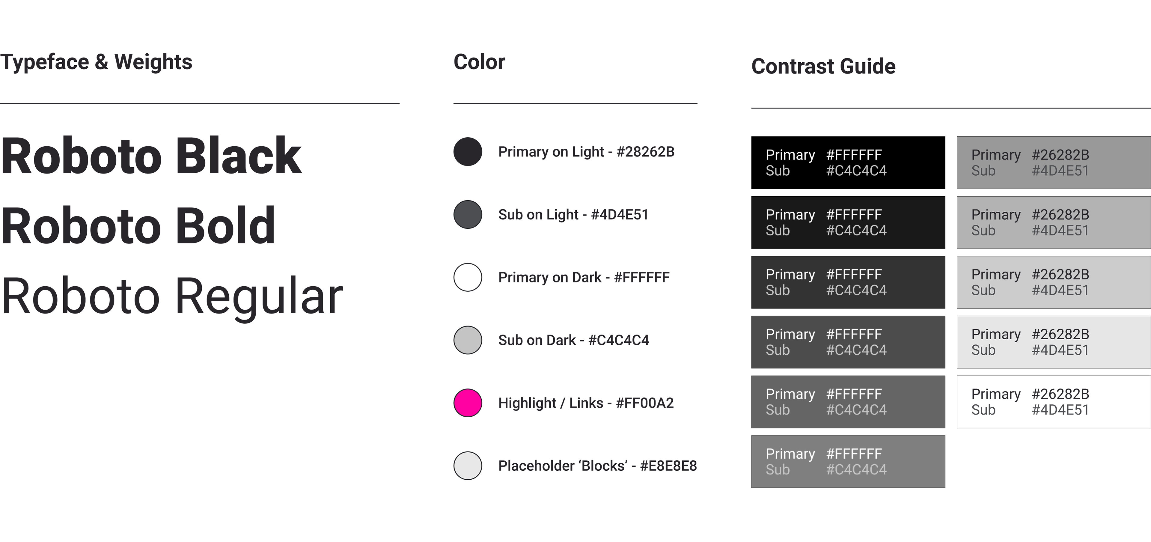
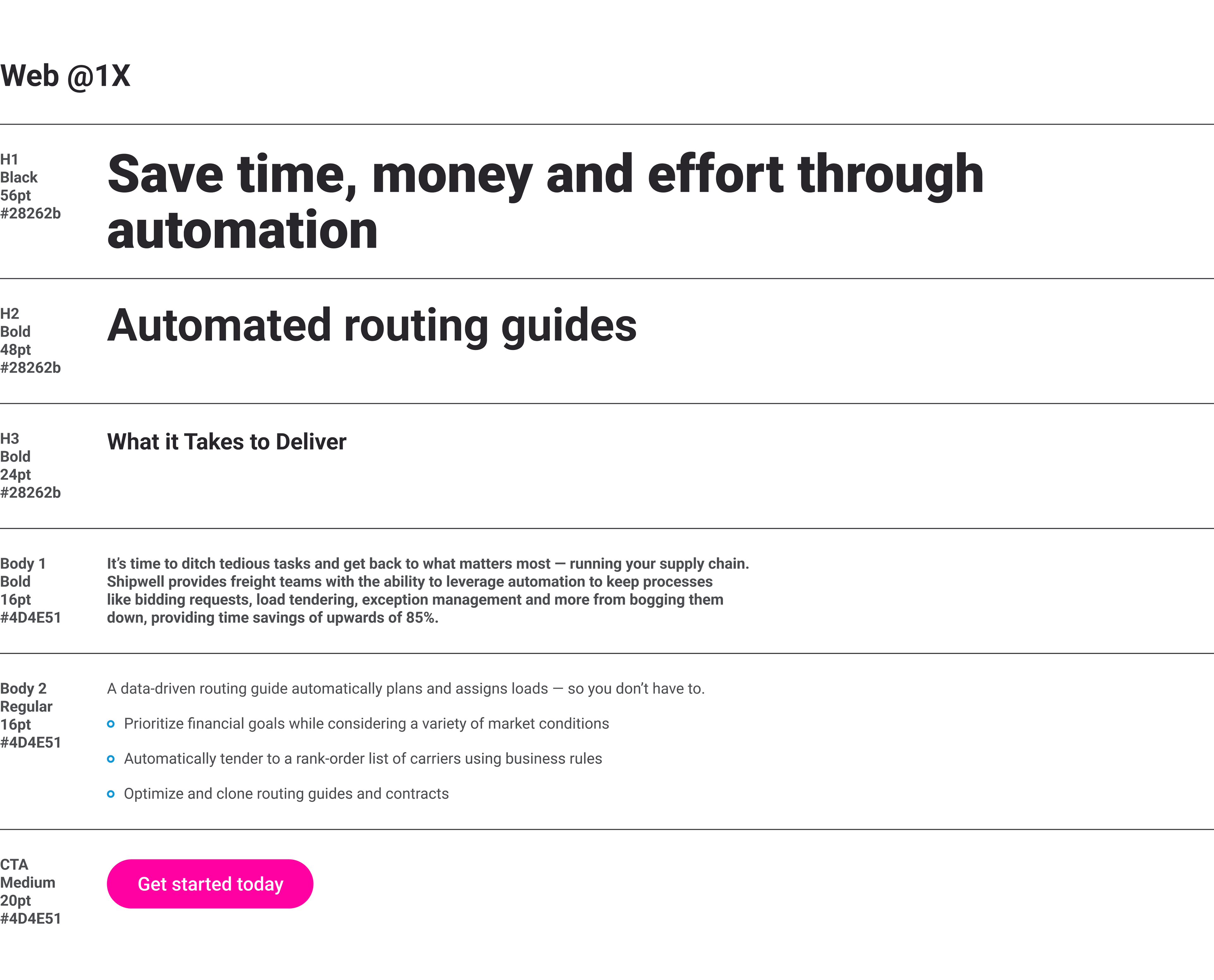
Colors, point size and hierarchy all laid out via Text Styles in the Figma and Adobe Libraries

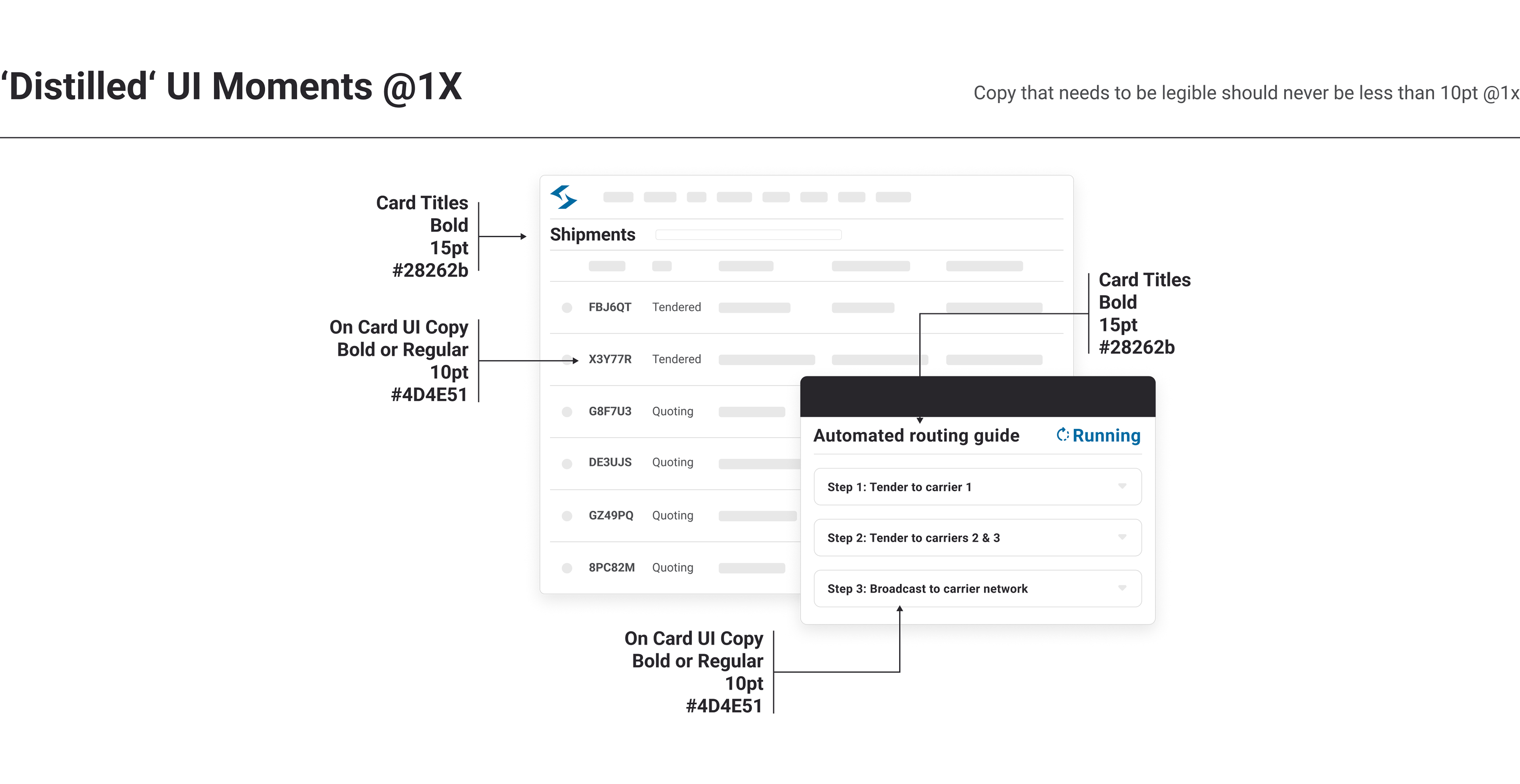
Our UI Illustrations (courtesy of yours truly) benefit from a uniform standard via Libraries as well

Stock Photography
Before this new design system our stock photo choices were... all over the pace.
We’re a small team with tight deadlines and an at times scrappy budget. There’s no photoshoots in the budget so stock photography is the name of the game and there’s a lot of stock photos out there that look like, well, stock photography. If you present yourself as a leading company in the space you can’t have that.
To help prevent a future stock-pocalypse I put some guides in place and an ‘example gallery’ to help people choose high quality stock photos that look as un-stock as possible.
I’m also a huge believer that sharing is caring and ensured a central repository of licensed images was built for quick access by all team members. No going into Shutterstock / Adobe Stock and sifting through licensed images to find one a team member downloaded six months ago.

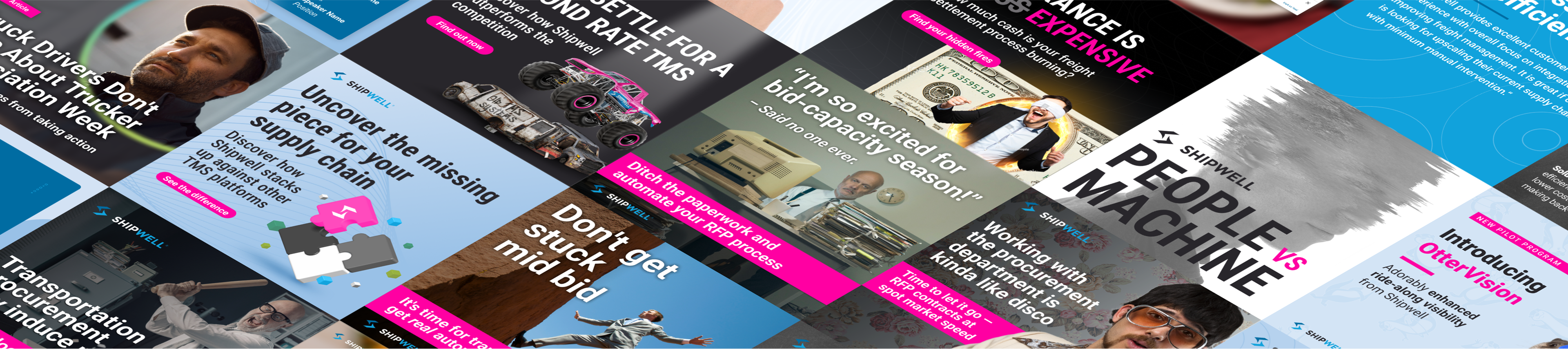
Lifestyle lifestyle lifestyle. Stock photos should depict a slice of life. Avoid 'staged' at all costs. Unless you're going for something humorous.

Icons & Illustrations
As mentioned earlier, Shipwell’s design and marketing team is quite small so we can’t always service every creative need that rears its head (as much as we would really like to. Often times a last minute deck needs to be made or a product flow needs to be illustrated and if you’ve ever been on the approving end of that, what people grab can be... interesting? To solve (as much as we can) that particular issue I wanted to build an icon library that represents our companies products and features as well as benefits and differentiators. Available in six jaw dropping branded colors!
For each term we created icons in two sizes. ‘Spot’ for larger applications like decks and presentations where a higher fidelity icon can stand out. ‘Small’ for, well, smaller applications where details will blur and context can be lost. Using Material design as a guide I created new icons where needed but in many cases an existing Material icon worked just fine. When you’re budget conscious, every billable hour counts.
All icons are added to our Figma and Adobe Libraries so anyone with access can grab what they want and drop them into their project! Since Google doesn’t have a library system of its own, the icons are exported and uploaded to Drive so they are easily searchable and ready to download for any Slides, PPT or Keynote presentation / deck that might need it.

Each available in six fantastic color ways including the stunning 'white' you see here. You do see it, right?

Capabilities & Solutions

Benefits & Differentiators

A deck of just text and icons is a little boring isn’t it? Sometimes you need something a little more, illustrative. Well I thought so too! For every icon we made, we created an illustration as well. Each little self contained illustration is ready to drop in to slide decks and presentation as needed. As with everything else in the system, it’s added to our libraries and uploaded to drive.
Below is small sample of the 51 illustrations created as a part of the system.


Each is 'self contained' so it can be placed anywhere on a page. No more wonky 'cut offs' from people dropping things where they shouldn't be.

Mascot
Last but definitely not least, a mascot was introduced to the Shipwell brand to soften the tech ‘edge’ and add a fun element nodding to Shipwell’s past name OTR Logic.
Meet ‘Swifty’ the pink otter!
Swifty is the embodiment of who Shipwell is as a company. Agile and curious with an eye for problem solving and choosing the right tool for the job.
While I’d love to claim credit for the actual design of Swifty, we did outsource that particular job and I simply provided art direction and the ‘emotes’ we needed.

Little arms, big heart

Look at that emotive little fella! Great for when you want to reinforce the emotion you want the user to be feeling. New product release? Get excited! Shipwell’s won another award? We’re mighty proud of that. Peak shipping season got you frustrated? We understand! But we can help.

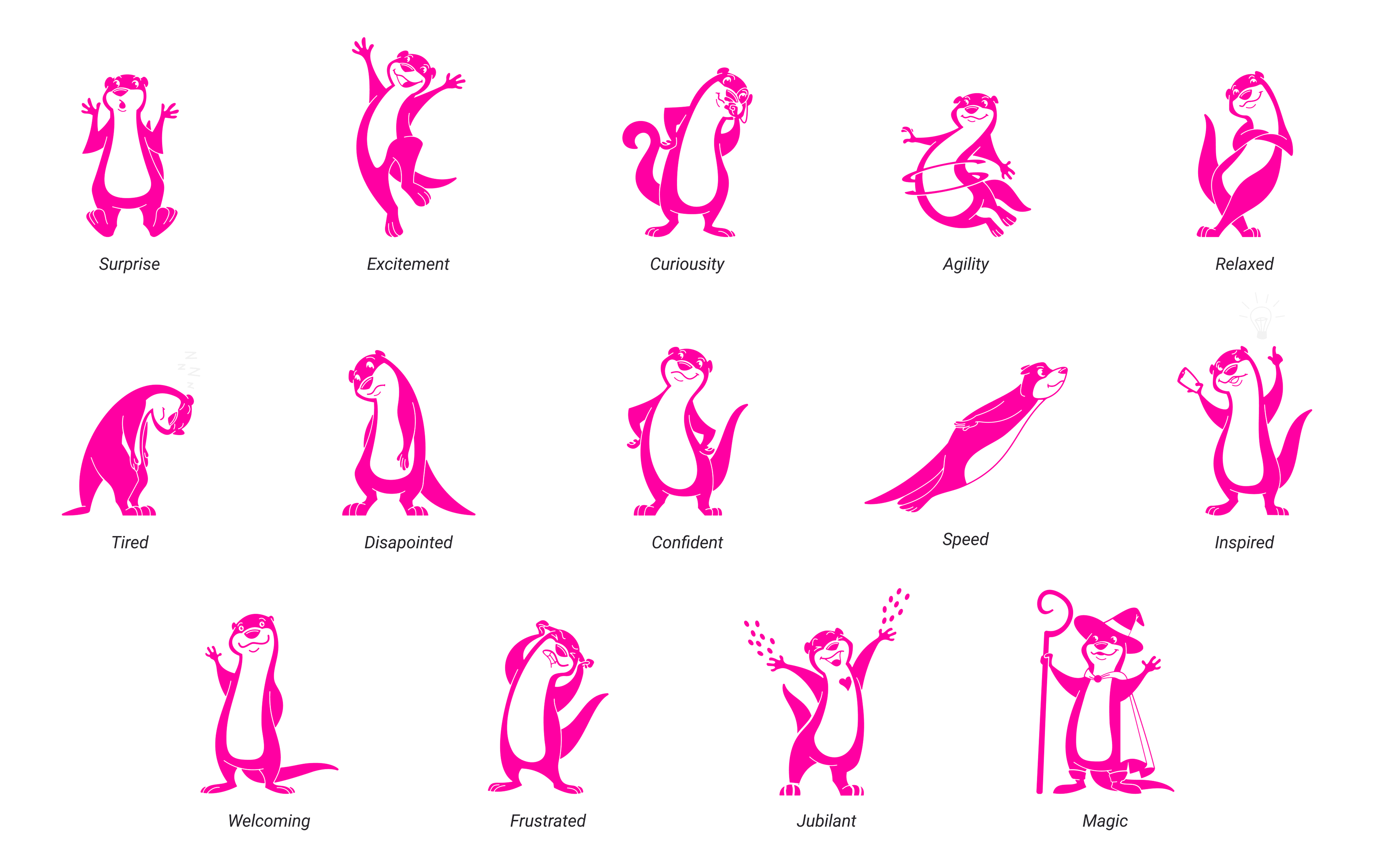
A 'Swifty' for every occasion

That’s a wrap!
Phew! There’s a LOT more to the design system but you’ve been scrolling long enough and patient enough to read through this so I'll spare you all the true minutiae involved. It was an incredibly rewarding project to work on and the effect it had on asset production and creative reviews cannot be understated. The objectives were met and it’s given us the ability to focus on the messaging and creative aspects of our work, not just ‘Did they use the right color?’ or ‘Is that icon in our style?’
Interested in seeing the system in action? Take a stroll on over to the Shipwell site and see it all in action! There’s even some nifty UI Illustrations I did over there.
Thanks for reading and I’ll see you around!
Back to Top